Hop, Throttle, Soar: Adam's Picture
This illustration is a very special piece that I was honored to be asked to do because it's for a four year old boy named Adam Grover. Adam's two favorite things in the world are frogs and the Blue Thunder Monster Truck. Adam was diagnosed with Mitochondrial Myopathy Complexes I & IV on June 4th 2008. This mitochondrial disease affects the mitochondria of the cells, which harness energy for the body. The disease leaves him very tired, among other symptoms, that get in the way of living life as four year old boy who wants to play and go to school. It ultimately leads to fatality, and there is no cure. There are certain kinds of vitamins that can possibly help to treat this disease, but insurance does not cover them. Here's a picture of Adam and his Blue Thunder toy:
This piece is going to be presented to Adam at his Make A Wish party this spring, where Blue Thunder and its driver will be present. I am beyond touched and grateful at being able to participate in this celebration of Adam. To find out more about Adam and/or to find out how donate to his fund to help contribute to medical costs, please click here.
The challenge for this picture was to come up with a way to integrate the frogs and the Blue Thunder Monster Truck into an image together so that it made sense. I wanted to draw tree frogs because I think they are simultaneously beautiful and odd looking animals. I love their bright green color and their contrasting bright red eyes. Their bodies are a lot like rubber humans, which make them fun to draw. I thought the best way to overcome the size difference between small frogs and a huge truck was to show the frogs in the foreground, and Blue Thunder behind them. Because these frogs live in the rain forest, I thought it would be great to showcase the truck ramping off of the rain forest mountainside. This gave me an excuse to be able to illustrate a lush rain forest aerial landscape shot. I like these kinds of views because they let me to create the kind of picture where you want to go inside it and explore all the different places in it. Click on the pictures below to access larger versions.
Blue Thunder Detail: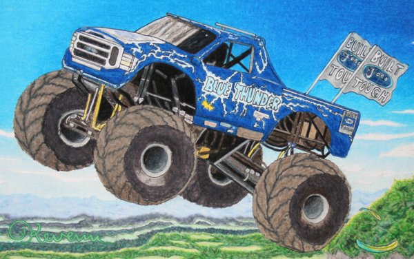
Frogs on the left detail: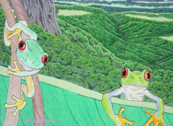
Frogs on the right detail: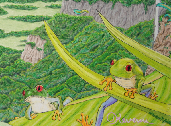
11.5 x 7.75 Bristol board.
Pencil, ink, Prismacolor pencil.
©Kevenn T. Smith 2011
Cold Hands, Warm Heart: An Ice Valentine by Kevenn T. Smith
This is a Valentine artcard featuring Justice League international character, Ice, whose real name is Tora Olafsdotter. Ice is a princess of a tribe of magic people hidden in Norway. Her powers allow her to create and manipulate ice. And while her powers are very cold, Ice is known for her warm and sweet personality.
Because February is such a cold month where I live, and because Ice is such a caring person, I thought she'd be perfect for a Valentine's Day card. Ice was stupidly killed off at one point, but has been thankfully resurrected by Gail Simone during her first run of the Birds of Prey title. I am very glad Tora was brought back, because there aren't enough loving characters like her in the comics. Not every character needs be be tough and hard or sarcastic and bitter. She even charmed the heart of a hardened character like Green Lantern, Guy Gardner. Ice brings personality diversity to the characters in comic books, and I like to give her features a more diverse look as well. While I was doing this card, I really liked the idea of making her eyelashes white as well. I think they give her a very fantastical quality.
This artcard and all the other artcards I’ve done are all original hand-made works and can be purchased or $15 plus shipping ($4.95 USPS Priority Shipping – international shipping will be calculated upon an individual order).
4.25 x 5.5 inches cardstock.
Pencil, ink, Prismacolor pencil.
Ice, Tora Olafsdotter ©DC Comics 2010
Now also available as cards and postcards at RedBubble.com!
Singular Sensation: Yurgod the Gryphon
This Singular Sensation entry showcases my illustration of Yurgod the Gryphon that I did for the wrap-around cover of issue #37 of Oziana Magazine. Yurgod the Gryphon is a character from the Russian Oz series of books. When The Wonderful Wizard of Oz was translated into Russian, it seems that it took on a life of its own, and several follow-up books were written in Russian, completely separate from the Oz books that L. Frank Baum continued to write.
I was completely unfamiliar with Yurgod, but the challenge for the cover was to showcase characters that appeared in stories inside the issue. Some characters I knew, but others, like Yurgod, I only had was a couple of images of him provided by my editor. However, he was a visually appealing character, and I was eager to try my own take on him. How could I resist the chance to draw a fantastical creature like this? The drawings I had were very stylized, and I wanted to inject a sense of realism in anatomy to my version. In order to depict him in a way that he would fit in even better with other Oz characters more firmly established in the canon, I wanted to add the bow to the end of his tail to echo the bows on the ends of the tails of the Cowardly Lion and the Hungry Tiger. I think the bow makes him look decidedly "Ozzy."
Pencils, Ink, Prismacolor Color Pencils, and Photoshop.
©Kevenn T. Smith 2011
Now available on a t-shirt at RedBubble.com!
A Boy And His Dog: Superboy & Krypto the Superdog
This is a commission piece that I did of Superboy, Conner (Kon-El) Kent, and Krypto the Superdog. Superboy is a clone using DNA of both Superman and Lex Luthor. The current DC Comics stories have Conner living with Martha Kent on the Kent Farm and going to school in Smallville, much like Clark Kent did when he was growing up.
For me, this piece was also an opportunity to go back to the rural small towns and farm areas that were nearby where I went to college. I had the opportunity to go back there earlier this year for a wedding, and I think it really helped me in depicting the small town/rural setting.
This illustration is available as prints. Please use the "Contact Me" form at the top-left of this page to request one and inquire further about pricing and sizes.
![]()
8" x 10.5" on Bristol Board
Prismacolor Color Pencils
Superboy & Krypto © DC Comics 2011
Singular Sensation: Dorothy & Ozma - Princesses of Oz
You knew it was coming - the Singular Sensation entry that features the last part of the website header illustration. If you know The Wizard of Oz, you know who Dorothy is, however most people aren't used to seeing her portrayed as a blond. They expect to see a brunette with braided pigtails, ala Judy Garland. While Dorothy did look like that in the book, The Wonderful Wizard of Oz, with Dorothy's return in the third book of the Oz series, Ozma of Oz, Dorothy was portrayed as a blond with a fashionable haircut by John R. Neill. Neill continued to portray Dorothy with this look throughout the books that he illustrated, which equaled to many more appearances than brunette portrayal in the first book.
Princess Ozma of Oz came on the scene in the second book of the series, The Marvelous Land of Oz. Ozma, who was a fairy and the rightful ruler of Oz, was restored to the throne. When Ozma and Dorothy met, the two got along famously and became best friends. Ozma ended up making Dorothy a Princess of Oz. In the sixth book of the series (which Baum intended to be the last, but was besieged with requests of "More Oz, Mr. Baum!"), The Emerald City of Oz, Dorothy, along with Toto, Uncle Henry, and Aunt Em (and Eureka the kitten whom we met in the fourth book, Dorothy and the Wizard in Oz) all moved to Oz permanently.
In portraying Dorothy, I like to stick to Neill's blond take on her. I also draw her with visual cues like silver shoes and in modernizing her, I give her a gingham-like print on her t-shirt. In Oz, you never grow older unless you want to, and Oz creators like Eric Shanower have Dorothy changing with the time, while remaining a child. Even Neill drew Dorothy's hair cut changing trhough the years that he illustrated the Oz books, through the early 1900's to the 30's.
I like that approach. Ozma is usually depicted as being a little bit older than Dorothy. Her pendant is a representation of the different areas of Oz: Green in the middle for the Emerald City, yellow Winkie Country to the west, the purple Quadling Country to the north, the blue Munchkin Country to the east, and the red Quadling Country in the south. Ozma was usually drawn wearing two large poppies on either side of her tiara, which I followed, but I left off some of the ornamental ribbons that were usually included on there as a way of showing that in some ways, Ozma is keeping up with the times too. Who wears ribbons in their hair any more? Like Dorothy, Ozma was also drawn differently as the Oz series progressed, even getting a little older. I also thought it'd be nice to break the background tradition for the Singular Sensation entries and include a more detailed background. It better contrasts with the rainbow magic and sparkles.
Pencils, Ink, Prismacolor Color Pencils, Watercolor, and Photoshop.
©Kevenn T. Smith 2011
Now available on a t-shirt at RedBubble.com!
Amazing Amazon - A Wonder Woman Art Event
My piece for Wonder Woman Day #4, "Here, Kitty! Kitty!" is being exhibited in the Amazing Amazon exhibit at the Lara Sydney Framing Gallery in Portland, Oregon. It will be available for viewing between October 1 and October 24. On the 25th, it will be available for bidding at the charity auction for Wonder Woman Day #4.
A Not-Too-Dark Knight - Batman Artcard
This next artcard that I'm spotlighting is of the Caped Crusader, Batman. Everyone knows Batman. For this artcard, I wanted to do an homage to the logo for Bruce Timm's Batman: The Animated Series, yet rendered in my own style. Batman is pretty hardcore, so I wanted to give him stubble to show that sometimes he spends a lot of hours on the job. At the same time, he's also Bruce Wayne underneath that cowl, so there needs to be an element of "handsomeness" to the face. Bruce Wayne is supposed to be a charming millionaire playboy. When I started reading Batman comics in the early 90's, one of my favorites things about many of them, was how they depicted the night sky using colors other than black. My favorite was this teal green sort of color. That was where I pulled the inspiration from when it came to coloring the night sky for this piece.
This artcard is available as prints. Please use the "Contact Me" form at the top-left of this page to request one and inquire further about pricing and sizes.

4.25 x 5.5 inches cardstock.
Pencil, ink, Prismacolor pencil, Prismacolor marker.
Batman ©DC Comics 2011
Hello, Bluebird - Supergirl Artcard
This artcard is an all original work and can be purchased for $15 plus shipping ($4.95 USPS Priority Shipping - international shipping will be calculated upon an individual order). This artcard of Supergirl, Kara Zor-El, was one that I made for the Mid-Ohio Con for 2008. It has since received a coloring job by hand. My goal with it was to depict the feeling of the aerial ballet in the Supergirl movie starring Helen Slater.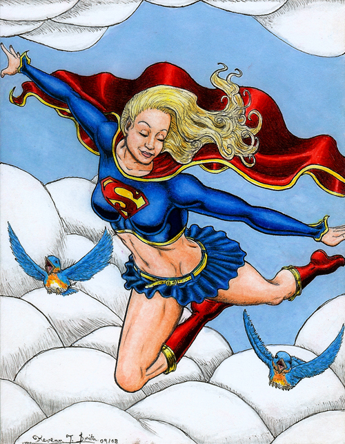
4.25 x 5.5 inches cardstock.
Pencil, ink, Prismacolor pencil, Prismacolor marker.
Supergirl ©DC Comics 2011
"Here, Kitty, Kitty!" for Wonder Woman Day #4
I'm participating in the Wonder Woman Day IV Charity Auction this year. The auction benefits these Domestic Violence Shelters and hot-lines: Raphael House of Portland, Bradley-Angle House, and Portland Women's Crisis Line. I am very proud to participate in this auction because these are very important causes to me. Please bid, and bid high!
I wanted to do a picture of Wonder Woman being happy and having fun - something that I don't think happens nearly enough in the comic books. I also really wanted to draw She-Ra and Catra, as well as Wonder Woman's enemy, Cheetah. Most pictures I've seen that have Wonder Woman and She-Ra together have them fighting each other. I really don't care for that, because I believe that Wonder Woman and She-Ra would get along really well and enjoy a tremendous sense of camaraderie, and I wanted to show them being friendly and having fun together. I also wanted to play on the fact that they both have well-known enemies with a cat theme.
While I take a lot of my cues for Wonder Woman and Cheetah from the way that Terry Dodson depicted them when he drew the Wonder Woman comic book, I also take a couple of Lynda Carter elements that I sneak in here and there with Wonder Woman. Cheetah also has a few George Perez elements in her design, especially when it comes to her facial markings, which Dodson mostly abandoned.
She-Ra and Catra were really fun to draw. I'm a big fan of Mattel's Masters of the Universe Classics action figure line. It's a melding of various canons of their franchises into one cohesive line. My approach to She-Ra and Catra was along that lines. I wanted to depict them with the familiarity of the Filmation designs of the cartoon that everyone knows and loves these characters from, but also bring in some of the details that the action figures had, whose designs were very different from the cartoon designs. The result give detailed and interesting looks that easily stand up well alongside Wonder Woman and Cheetah.
The background is inspired by the Whispering Woods background paintings that were featured in the She-Ra: Princess of Power cartoon. They are lush, flamboyant and magical looking. As I was planning out the background, I thought it would be fun to have Lookie in it. Lookie was always hiding in the background of the cartoons, and at the end of the episodes, he would reveal his hiding place and explain the episode's moral. Once I decided that Lookie was going to be in it, I wanted to balance the picture, and tried to think of a character in Wonder Woman's lore that could serve as an analogue to Lookie. The two franchises are pretty rife with analogues: Ares/Hordak, Circe/Shadow Weaver, Giganta/Scorpia, Steve Trevor/Bow, Nemesis/Sea Hawk. When it came down to it, I settled on the whimsical and fun Wonder Tot, who is Wonder Woman as a small child in the Silver Age comic book stories. Wonder Tot often had "impossible adventures" right alongside Wonder Woman as an adult and Wonder Woman as a teenager (Wonder Girl), and I thought that the magical nature of the Whispering Woods, and the fact that She-Ra's planet of Etheria was likely in another dimension, would provide a narrative that would allow Wonder Tot.
This illustration is available as prints. Please use the "Contact Me" form at the top-left of this page to request one and inquire further about pricing and sizes.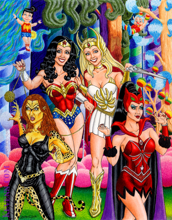
Here, Kitty, Kitty!
8.5″ x 11″ on Bristol Board
Pencils, Inks and Prismacolor Color Pencils
Wonder Woman, Cheetah and Wonder Tot ©DC Comics 2010
She-Ra, Catra and Lookie ©Mattel 2010
Marla Bea Benefit Comic Book Auction: Wonder Woman & Power Girl
This piece was penciled by Ray Caspio, and I was the inker and colorist. We made this piece for the Marla Bea Benefit Comic Book Auction that begins on Monday, October 12, 2009. All proceeds from the auction will benefit the Holden Comprehensive Cancer Center at the University of Iowa Hospital and Clinics. I lost a very good and dear friend several years ago to breast cancer, so this is a cause that I feel very strongly about and is very close to me. I was very happy and proud to be able to participate in this auction, and I hope that our piece will raise a lot of money to contribute in the fight against breast cancer. Please consider bidding in the auction to support this worthy cause. Wonder Woman & Power Girl for Marla Bea Benefit8.75″ x 12″ on Bristol Board
Ray Caspio: Pencils
Kevenn T. Smith: Inks, Prismacolor Color Pencils, and Prismacolor Markers
Wonder Woman and Power Girl ©DC Comics 2011
Singular Sensation: The Scarecrow and the Tin Woodman
This Singular Sensation entry spotlights the illustration of the Scarecrow and the Tin Woodman that I did for the header for this site. These are two of my favorite Oz characters to do, and I especially enjoy drawing them together and showing the tremendous bond that these two characters have for one another. In most of Baum's books, they both have castles in the Winkie country to the West that are very close to one another.
For the Scarecrow, I do go back to Baum's text with details like one eye being bigger than the other. However, I'm also greatly influenced by the depictions that John R. Neill and Michael Herring did of him as well. I wanted to convey a sense of him being a little off balance, like Ray Bolger was in the MGM musical.
Nick Chopper, the Tin Woodman, presents a special challenge when looking at how Neill and Herring depicted him. Their renditions, quite frankly, defy the laws of physics. They draw the Tin Woodman with nearly two dimensional limbs that are hinged basically with pins onto the sides of his torso. This leaves him incapable of a wide range of movement, but didn't stop them from somehow depicting him holding his ax with two hands. I wanted to base my version a little more in reality, so there was no real way that he would be able to reach across his own body to point toward the Scarecrow if his arm was simply pinned at the shoulder to his torso. For me, the solution was to basically treat him like he was a human-sized action figure and give him ball joints that not only hinged, but swiveled and allowed for rotation.
Neill and Herring depicted him basically wearing a suit of tin with the collar, the side pockets, and the buttons down his torso, so I did as well. They'd also draw him wearing spats on his feet, a bow tie around his neck, and a flower "pinned" on. One thing that I added that's usually forgotten, is when the Tin Woodman gets his heart from the Wizard of Oz in the first book, he is patched up on his chest, and a gold star is placed over where his heart is. This gold star is usually omitted by many artists, but I like to add it, because I think it's a nice detail that adds more character and visual interest to him.
Pencils, Ink, Prismacolor Color Pencils, and Photoshop.
©Kevenn T. Smith 2011
Now available on a t-shirt at RedBubble.com!
Singular Sensation: The Hungry Tiger of Oz
This Singular Sensation entry features my illustration of The Hungry Tiger of Oz that appeared smaller and partially obscured on the original "Contact Me" page of this site. The Hungry Tiger was officially introduced in L. Frank Baum's third Oz book, Ozma of Oz. However, many people believe (and I'm one of them) that he was also the same tiger that appeared in a chapter near the end of The Wonderful Wizard of Oz, where Dorothy and her friends are on their way to the Quadling Country in the south of Oz to see Glinda about getting Dorothy home. In the chapter, the Cowardly Lion defeats a giant spider-like monster who is terrorizing animals in a forest, and he ends up becoming their king.
In Ozma of Oz, we meet the tiger, who is the Cowardly Lion's trusty companion by this time, and we learn why he's called the Hungry Tiger. Apprently, he has an insatiable appetite for fat babies. The thought of a corpulent little infant makes his mouth water, but he's never able to devour one because his conscious always prevents him. Throughout the Oz series, the Hungry Tiger is a member of Ozma's court, and also serves alongside the Cowardly Lion as an imposing figure reclining near Princess Ozma's throne.
For this illustration, the Hungry Tiger has often been depicted wearing a pink bow around his tail, but I thought that a teal green bow would pop better against the orange fur of the tiger. Baum also wrote that the Hungry Tiger had purple stripes in his first appearance, but I'm not a fan of purple stripes on a tiger, and he's usually not depicted having them either - by John O'Neill the most prolific Oz illustrator, or Michael Herring, who illustrated the covers for the Del Rey paperback editions that I grew up on. For his face, I used some elements of my dogs Lucy and Humphrey for inspiration, especially when it comes to the tip of his tongue sticking out.

Pencils, Ink, Prismacolor Color Pencils, and Photoshop.
©Kevenn T. Smith 2011
Now available along with The Cowardly Lion on a t-shirt at RedBubble.com!
Singular Sensation: The Cowardly Lion
This Singular Sensation entry focuses on the Cowardly Lion illustration that I did for the original "contact Me: page of this site. I wanted to present him bigger here than he appears on that page. Everyone knows the Cowardly Lion, but most people are used to thinking of the Cowardly Lion in terms of a person dressed up in a costume, like Burt Lahr in the MGM movie. However, in the books, the Cowardly Lion is a real lion who talks, like all of the animals in Oz do.
I think that when the lion is presented as an actual large lion who acts cowardly, as opposed to a person in a costume, the visuals get to be more interesting and contradictory to the behavior. For this interpretation of the Cowardly Lion, I wanted to make him more personal. I made his eyes bigger than an actual lion's eyes, while keeping the rest of the lion's anatomical proportions intact. Another thing about the eyes, were that I based them on my dog, Humphrey. He's like my own personal Cowardly Lion, who is all bark, but when someone actually stands up to him (like a cat), he runs away crying.
The bows are things that John R. Neill drew on the Cowardly Lion when he originally illustrated the Oz books. I think they're great touches that serve to visually reinforce the contrasts going on with the cowardliness and the powerful frame of a lion. Michael Herring usually painted the bows light blue in the covers that he did for the Del Rey paperback editions of the Oz books, and those were the printings of the books that I grew up with, so I tend to try to give little nods to him and Neill when I illustrate Oz characters.
Pencils, Ink, Prismacolor Color Pencils, and Photoshop.
©Kevenn T. Smith 2011
Now available along with The Hungry Tiger on a t-shirt at RedBubble.com!
Earth-2 Huntress: Helena Wayne
This is a commission that I did for my friend and writer, J.H. Moffat who runs the online urban fiction magazine, Drops of Crimson. This piece is of the Earth-2 Huntress, Helena Wayne. Earth-2 was a parallel earth where Batman and Catwoman had their career in the 1940's and ended up marrying and having a daughter, Helena. Catwoman was eventually killed, and Batman died, and Helena carried on their legacy as the Huntress.
The newer version of this illustration is available as prints. Please use the "Contact Me" form at the top-left of this page to request one and inquire further about pricing and sizes.
Pencils, Ink, Prismacolor Color Pencils, Photoshop, and Adobe Illustrator.
©Kevenn T. Smith 2011
Earth-2 Huntress ©DC Comics 2011
Singular Sensation: Polychrome
The third entry in my Singular Sensation series is of another character that I drew for the wrap-around cover of Oziana #37, Polychrome. This was the third time I had drawn Polychrome, and only the second time I had colored a drawing of her. She is a fairy and the daughter of the rainbow, and coloring her can be quite a complicated process. In the books, she is always described and depicted as wearing a dress in rainbow colors. I didn't want the colors to just be plain vertical stripes. That would be boring. It was a fun challenge to have them blend all together in a diagonal direction. In the books, she's usually always dancing about, so it was very important that there be a sense of energy going on.
Polychrome is a visually fascinating character to me, like Scraps the Patchwork Girl, because of all the colors involved. The great thing about the two characters is seeing how two characters full of different colors can also look so differently. Scraps is a loud and boisterous character in the books, so her colors need to be intense. Polychrome is usually written as a sweet and passive character, so I use tones that are, in comparison, more subdued on her.
Pencils, Ink, Prismacolor Color Pencils, Photoshop, and Adobe Illustrator.
©Kevenn T. Smith 2011
Now available as a t-shirt on RedBubble.com!
Spider-Man: The Boys Next Door
I'm currently involved in a local production of the play, The Boys Next Door. The play is set in the early 1980's, and one of the characters has a scene where he wears a Spider-Man tie. No one could find a Spider-Man tie in the stores in our area, so I volunteered to make one. I wanted to make it rather simplistic. It couldn't have all the dramatic coloring that comic book characters have nowadays, though I did add some shades and tones to keep it from looking completely flat. The tie that the design went on is red, and has a pattern on it that is suggestive of a spider web.
Adobe Illustrator, Photoshop
©Kevenn T. Smith 2011
Spider-Man ©Marvel Comics 2011
Singular Sensation: Pig Guard
This second entry in my Singular Sensation series is of a character drawn for the cover of Oziana #37. I simply call him "Pig Guard." I got a request to draw characters that appeared in stories in the issue, but I didn't always have access to the actual stories. In some cases, all I got was copies of artwork being used to illustrate the stories. In this case, all I had was an illustration to go on, but one that really captured my imagination. I am a big fan of the work that The Four Horsemen studio did on updating Mattel's Masters of the Universe property for the 2002 line. The amount of detail they put into each of the character re-designs continues to impress me. When I saw the illustration of this "Pig Guard" character, I thought it would be a really fun idea to give him that same kind of approach. I wanted to put more detail into his look and to introduce a more aggressive and physical element to the entire wrap-around cover piece.
In the cover piece, the Pig Guard was going to be fighting on the same side as Bastinda, the Russian version of the Wicked Witch of the West. I thought it would be a nice homage to the Winkie Soldiers in the MGM musical movie version of The Wizard of Oz if I made the Pig Guard's skin green. However, when I thought about that, I worried that some people would think that I was trying to rip off the Gammorean Guards in the palace of Jabba the Hutt in Return of the Jedi. So that idea was nixed. I still wanted to make the Pig Guard look more otherwordly, instead of a pink, tan, or brown skin tones that one usually found on a pig. That's when I hit upon the idea to make the skin tone a nice "decayed blue." It really worked too! I thought I was being so original, until a friend pointed out that Gannon, the Big Boss in The Legend of Zelda game for Nintendo, was a big blue pig. It's true, there really is nothing entirely new! I haven't played that game in years, but from what I remember of the character, I think I made this Pig Guard look significantly different.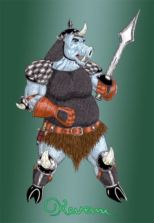
Pencils, Ink, Prismacolor Color Pencils, Photoshop, and Adobe Illustrator.
©Kevenn T. Smith 2011
Singular Sensation: Scraps the Patchwork Girl of Oz
This is the first entry in a series of posts I plan on doing for this site that will showcase individual pieces of artwork that are used in larger pieces of work. Some of the pieces I work on are created in a collage-like manner. Creating work in that way allows me options in placement and makes doing things like special effects a lot easier. However, sometimes, the entire drawing doesn't always get showcased, or is showcased at a size that doesn't fully show off all the detail put into it.
This first "singular sensation" is to show off the full rendering of the Patchwork Girl illustration that I created for the title of this site. Now, all the different patterns and colors used in composing Scraps can be seen, all the way down to her shoes. Scraps is my favorite character from the Oz books. I felt that her colorful look and personality was the perfect central face for the first image that shows up on this site.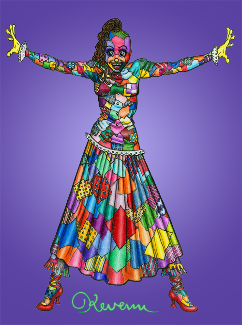
Pencils, Ink, Prismacolor Color Pencils, Photoshop, and Adobe Illustrator.
©Kevenn T. Smith 2011
Now available as a t-shirt on RedBubble.com!
Garden Walk
This is a piece that I did of my paternal grandmother. I used a different approach to it than I normally do, and I really like the way it turned out. I wanted to be a little less precise with the background, so instead of drawing it in with pencil, and then inking over it, I opted to only use the Prismacolor color pencils on it.
Pencils, Ink, and Prismacolor Color Pencils.
©Kevenn T. Smith 2011
Oziana #37
Oziana is the magazine of The International Wizard of Oz Club. I was very honored when I was asked to provide the cover for issue #37, which is to be the final issue of the magazine. The cover depicts characters featured in the stories contained inside the issue engaged in a magical battle inside the Emerald City.
Pictured in this piece from left to right are: a Boar Guard (from the Russian Oz Series), the Witched Wick (an original character to a story in the issue), Bastinda (the Russian series Wicked Witch of the West), Polychrome the Rainbow's Daughter, Bungle the Glass Cat, The Wizard of Oz, Yurgod the Gryphon (from the Russian series), Princess Ozma of Oz, and a Rain Sprite (an original character from a story in the issue)
The issue will be available to order from The International Wizard of Oz Club's website.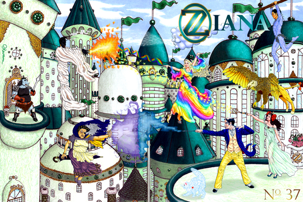
Pencils, Ink, Prismacolor Color Pencils, Prismacolor Markers, Photoshop, and Adobe Illustrator.
©Kevenn T. Smith 2011
